A Font for the World
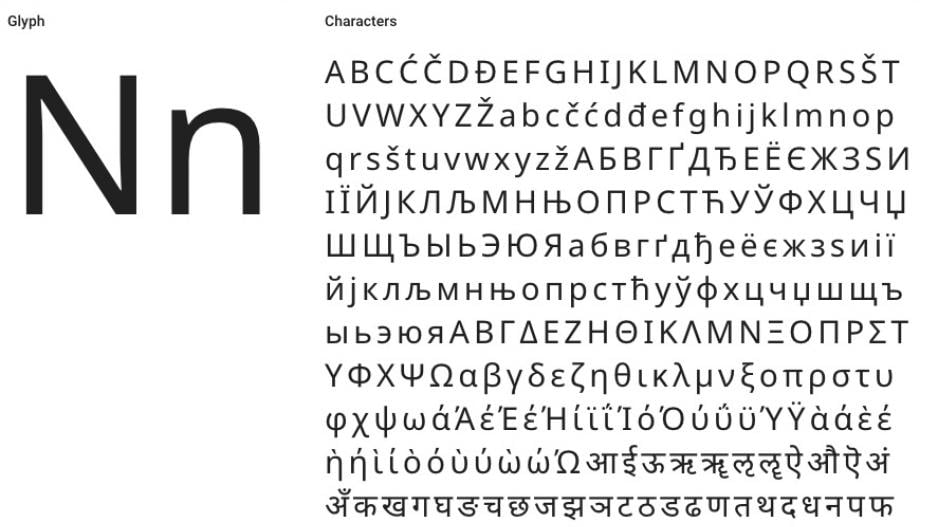
Once in a while something comes out of the Web which is exciting and extremely impressive. Last week saw the launch of Noto, Google’s latest online accomplishment that will wow font lovers and web designers across the world. Noto got it’s name from Google’s desire to rid the World Wide Web of blank characters (‘⯐’ , a.k.a. tofu), which appear when the original character is not availble in the devices language. Therefore no blank characters = ‘No more tofu’… Abbreviated gives us the name of the font that will impress you with its pleasing aesthetics in 800+ languages dead or alive, consisting of 110,000 characters and all in a universal style and finish.
It’s true, some people may not understand the big deal with this one, but all you need to know is it took 5 years to develop this font face and that trust us that sounds pretty quick for what they have achieved. I personally cannot wait to use it and see it in action and then leave it to never age for the entire world’s population to enjoy it as they should in a language they understand and in a font they can read with ease. Looking forward to using Noto in a website project very soon!